
Retired and living in Austria
I have retired from teaching. Carinthia is beautiful, is healthy, and the Austrian world view aligns with my own. Also, family is nearby. The hiking, both at altitude or down in the valleys, is delicious.

Editing by Design, 4th Edition is out

I am the co-author of the Fourth edition of Jan V. White’s Editing By Design, the 1974 seminal philosophy of how design is an editing process. The book is published by our long-time partners at Allworth Press.
The cover is an iteration of the opening spread in the original 1974 book: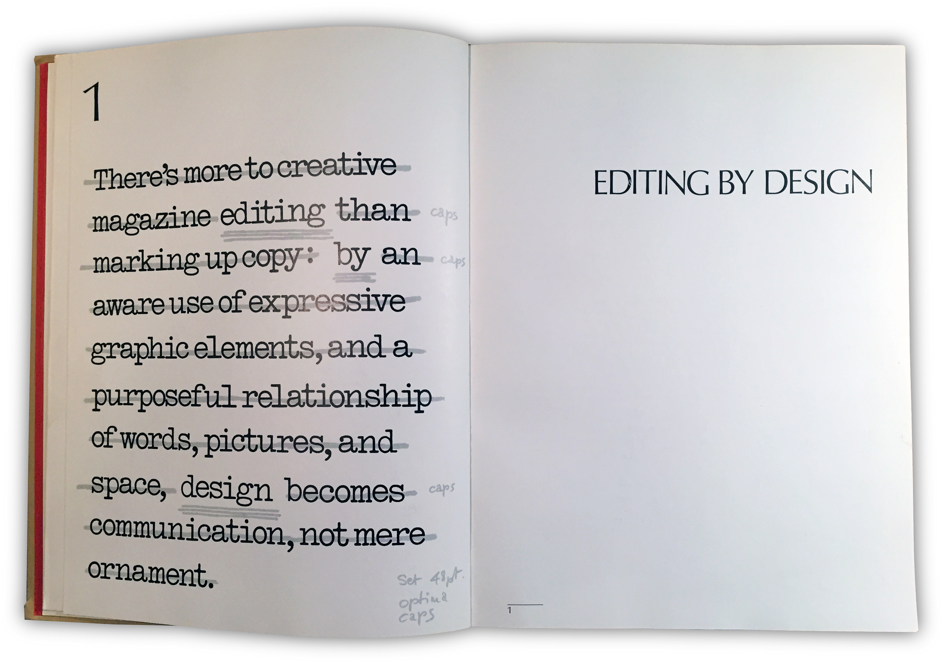

MPS Design Management students
Our last class after the final exam:
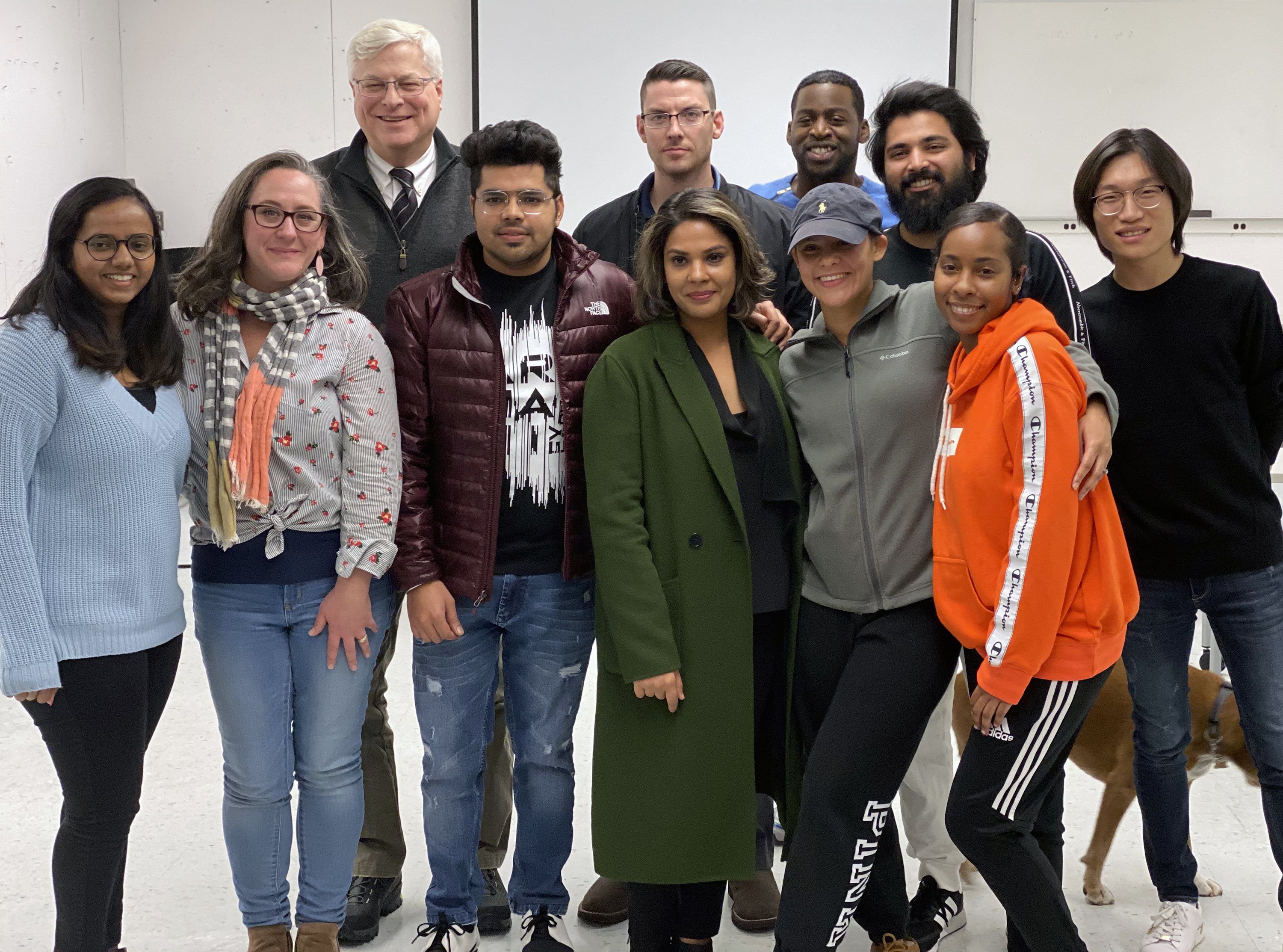
Coming from as far as NYC, we were joined by the graduates from last May for a celebration in ABC708:

An excellent academic year

My graduate students produced a magnificent final report to their client, the Maritime Aquarium at Norwalk. It provides 16 innovative solutions to the challenges M.A.N. faces with the replacement of the MetroNorth Rail Road bridge that bisects their facilities.
My sophomore graphic design students crafted some beautiful, thoughtful, value-added interpretations of given material. Only type, space, and non-representational imagery can be used.
I was elected to the consequential position of Moderator of UB’s University Senate for the 2018-2019 year. That was fun. Lastly, I have been awarded promotion to full professor, which is by no means an automatic evolution in a college professor’s career. It is gratifying to have one’s teaching, professional development, and service so recognized.
“The Most Misunderstood Teacher”
A former student prepared an interview for another course. The background music happened to be playing in my office during the interview. It is both magnificent and somewhat distracting. Sorry about that.
.
Profiled on ConnCreatives
Tenure every 25 years
I was honored to receive tenure this year from the University of Bridgeport. This is the second time I have been so honored by a fine school of design. I am proud and very pleased to become an affirmed member of the Shintaro Akatsu School of Design at UB.
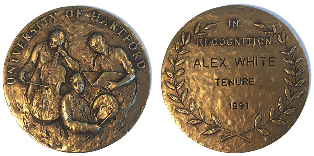 I received tenure in 1991 at the University of Hartford’s Hartford Art School (medal designed by the wonderful sculptor Lloyd Glasson). Life interrupted the continuity of my residence at that fine school in 2000. I anticipate going for a third tenure decision in another 25 years, which will be 2041.
Listening to Type: Making Language Visible released in August 2016

Listening to Type: Making Language Visible is a second edition of Thinking in Type: The Practical Philosophy of Typography, my 2005 book on typography. The title was changed to avoid confusion with another book with a closely similar title. A little background: it takes me 12-18 months to write a book and the title is determined fairly early on. After Thinking in Type’s first printing in 2005 – after it had been printed and about two weeks before it was released – we learned that the wonderful Ellen Lupton was about to publish a book with an unbelievably similar title: Thinking With Type. At that point there was nothing we could do. Her book came out a few weeks after mine. With the second edition of my book, we took the decision to change the title while making a significant expansion of the contents.
Blurbs on the back of Listening to Type read:
“My colleague, Alex W. White, has done it again. Even if you’ve read other books by Alex, particularly his Elements of Graphic Design, Listening to Type is a revelation. This book represents his clearest and most perceptive explanation of the building blocks of effective graphic design: space, image and, above all, type.”Brian D. Miller, Partner, Executive Creative Director, MillerSmith; author of Above the Fold, 2nd ed
“Maybe Alex White should be called the type whisperer. Examples of outstanding work are abundant throughout this volume. Typography, space, image, and color are the building blocks of graphic design and are beautifully represented. Splendidly arranged and easy to understand, this book is indispensible whether you are a relative novice or seasoned professional.” Graham Clifford, Independent Design Director and Chairman of the Type Directors Club
“My library has hundreds of books about typography and graphic design. Each provides a vantage point for seeing design differently. This is the first that challenges the reader to listen to the visuals. Strange though that concept may be, there’s deep truth there, and a plethora of beauty to hear.” Charles Nix, Senior Type Designer, Monotype; Chairman Emeritus, Type Directors Club; Former Chairman of Communication Design at Parsons the New School for Design
Advertising Design & Typography released as a Second Edition in 2015

A new updated softcover edition of Advertising Design & Typography was published in July 2015. This is the addition to the Preface:
“Since writing the first edition of this book in 2007, I have developed a wider evaluation of the role of design in business. This is a result of having served as the chairman of a graduate program in Design Management. I lead one of a dozen graduate programs in the country that share a common goal: to help designers – advertising designers, graphic designers, industrial designers, architectural designers, and all other flavors of designers – learn how to apply their onboard design talents to business problems. This is a relatively new field of practice, but the fundamentals are that design thinking, a specific way of solving problems that in essence leaves no stone unturned, is applied to business problems in order to develop innovative solutions. This is accomplished by researching and applying inspiring and successful examples from outside the specific area being worked on. Design management proposals are judged on three criteria: economic viability, social and cultural contribution, and sustainability (which primarily addresses ecological sustainability, but also considers economic, political, and cultural sustainabilities).”
“In today’s business environment, advertising designers must consider new aspects of increasing sales for their clients because their audience expects it. Design management is the best way I know to approach deeper thinking. I have been teaching design for the user’s benefit since 1983. It wasn’t called design thinking then, but I have always promoted an exploration of the most potent expression of an idea. This book is filled with examples of the most potent expression of ideas. Blandness can’t possibly sell because it can’t be seen. An ad must be seen to produce a reaction, which is an ad’s truest task: to make the viewer do something.”
View improves with new position
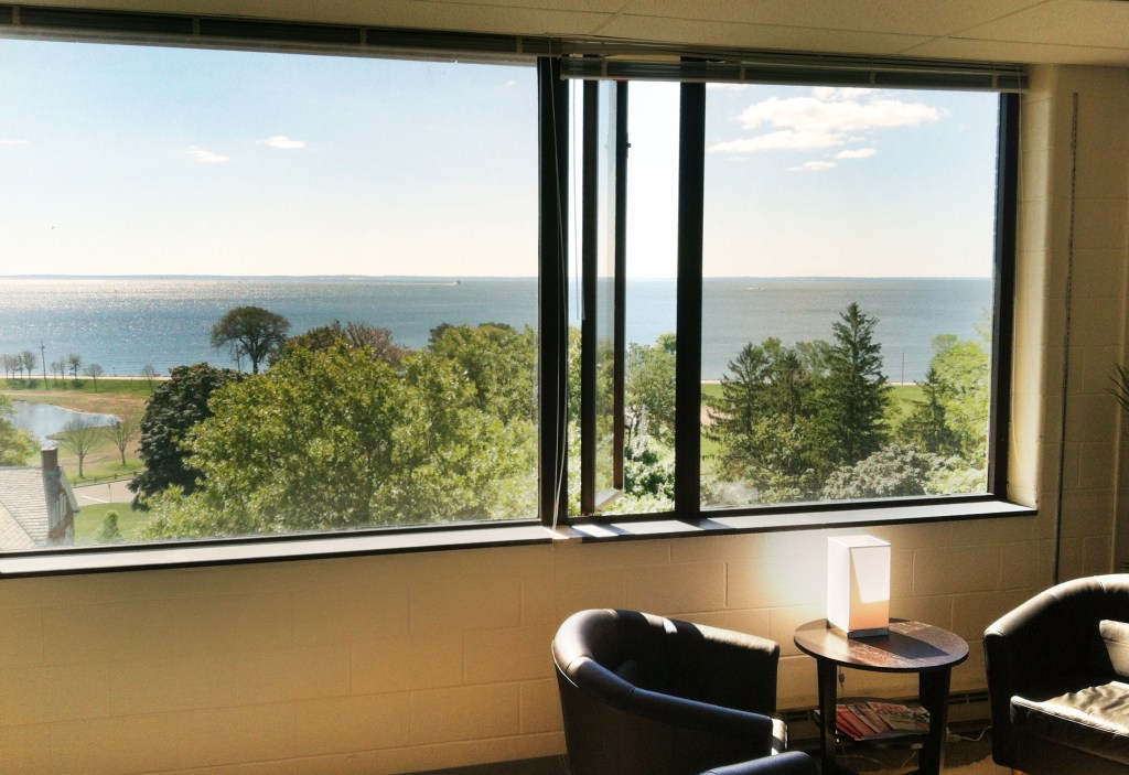 I have joined the Shintaro Akatsu School of Design (SASD) at the University of Bridgeport as the Chairman of the Master of Professional Studies program in Design Management. Besides encouraging insightful work from an international group of smart, talented, highly-motivated graduate students, I get to enjoy this beautiful view from the seventh floor of a magnificent facility directly on Long Island Sound.
Professing graphic design again in Yantai, China

I was invited to return to teach for a second time in the graphic design program at Ludong University in Yantai, Shandong Province, China this past May (scroll down for a description of my first visit). Instead of three classes in two weeks, I was able to work a bit more in depth by teaching two courses in three weeks. It was a sheer delight to reconvene with the faculty and school leadership, who have become good friends.


Though I have been told southern China has a much more varied and challenging menu, I had my first “sea rabbit” (on Chang Dao, or “Long Island” above). Back on the mainland I had pig’s head and, completely by coincidence, my first duck’s head later that same day. That was The Day of The Head. I was struck by how removed we Americans tend to be from the source of our protein: it is cut into pieces that are presented on foam plastic trays under plastic wrap in beautifully-lit supermarkets. That it ever came from any living creature is thoroughly disguised. It is a quite different eating experience when the creature’s eye is staring at you in situ. But there is nothing to be done but dig in – and both times I went for the cheek meat, which is approximately as far away from any namable face part as possible. The pig’s head was delicious. But you may be assured that eating duck’s head properly is a much more active process than merely picking at its comparatively-tiny cheek. We’ll leave it at that.
Venn diagrams

I was sent this by a friend, but the source is Cool Infographics, a valuable site. Colin Harman designed it, and it is a delight. Pass it on to friends and family, those who are most likely to remind you of this most frustrating triad.
A Venn diagram, according to Wikipedia, “shows all possible logical relations between a finite collection of sets… Venn diagrams were conceived around 1880 by John Venn (1834–1923), a British logician and philosopher. He is famous for introducing the Venn diagram, which is used in many fields including set theory, logic, and computer science.”

This is a Venn diagram by Rich Stevens 3, a former student of mine.

And this is a basic Venn diagram showing the intersection of two sets.
Professing graphic design in Yantai, China
I spent the last two weeks of December 2011 completing a two-week teaching gig at Ludong University in Yantai, Shandong Province, China. I was asked to teach graphic design there by the Shintaro Akatsu School of Design at the University of Bridgeport, with whom Ludong has developed an international affiliation. I followed an opening two-week visit by a colleague from SASD, Professor Emily Larned. As far as the leadership at Ludong University is aware, this is the first time graphic design has been taught in China by visiting Western professors.

Yantai is a city of 8 million people about an hour and ten minute’s flight east-southeast from Beijing. It is a port city on the Yellow Sea, so seafood is plentiful – and wonderfully different. In addition to being a regional business center, Yantai is also renowned for its extensive apple and cherry harvest.


This is a composite shot of a principle intersection in downtown Yantai: the buildings there are not actually tilted – at least not to this extreme. These photos were taken on a too-long run from campus: I was pressed for time an hour and ten into the run when I finally found my destination, the harbor. Asking passersby for a more direct route back to the university, I was told “too far” by the first two. I eventually got directions and made it back to campus in 35 additional all-uphill minutes. That was a no-rest-for-the-weary push.

Ludong University is a medium-sized Chinese institution of about 25,000 students, half of whom are studying at the graduate level. They draw their students from all over China, though the majority come from Shandong Province, which is a large area – taking about seven hours to drive across from end to end.

I asked to meet each of my three classes ten times – once per day for the two weeks I was there – and expected to leave China very tired, but we compromised and I met each class eight times over the two weeks. That provided nearly the maximum number of critique opportunities to discuss the students’ design thinking shown in their homework. This is a very early critique because many of the studies show random abstractions that have nothing to do with the originating letterform nor the intended abstract expressions. But the light approach I try to take with experimental work is plain on the students’ faces. They may have been laughing at my Chinese pronunciation: WOH bu geedoh. Woh BU geedoh? Woh bu GEEdoh… Woh bu geeDOH! Wherever you put the emphasis, it means “I don’t know.”


Paper in China is not particularly expensive, but it is respected as a finite resource. Instead of taking notes, students photograph everything with their phones, including their professor who is holding up a study for discussion. Chinese students do not own their own printers, so outputting studies at the local print shop, which is closed from 7pm until 8am, is part of their homework planning.

The two-week course could not have been nearly as successful without the extraordinary skill of Xu Shanshan (or “Sophie,” in the foreground), my graduate-student interpreter and translator. I was talking for two weeks about letterform abstraction, image abstraction, and conceptual abstraction, none of which are especially easy to grasp in English (I know this: I teach it regularly), and Sophie not only translated what I said, she understood and was wonderfully able to express what I meant. This was made evident in the students’ work.

Here are most of the students with whom I worked at Ludong with Sophie, who is holding an inscribed copy of my Advertising Design and Typography book. It was important to me that she be presented with this in the presence of “our” students.

It was cold, snowing every couple of days, and heat is extremely carefully used. Coats are worn by everyone all the time, outdoors and in. Twice-per-week celebratory dinners with professors, deans, and key administrators were occasions to eat until failure: a brilliant ritual!

There were several opportunities to visit extraordinary cultural sites. This huge Taoist temple is near the town of Guzhen, Qixia City, very near the Mu Family Manor, the largest (480 rooms) intact feudal landlord manor in northern China and a protected historical site which was begun in 1723.
Talk therapy on white space at Pratt Manhattan

I have been invited by the Graphic Artists Guild to speak at Pratt Institute (14th Street between 6th and 7th Avenues) in Manhattan on Thursday Nov3 at 7pm. The talk’s title is White Space in Design: Two Hours of Talk Therapy

Please join me. The lecture is $20 for Graphic Artists Guild members and $30 for others*. That is a saving of at least $400 over what you would pay for two hours of any other kind of talk therapy in Manhattan, which I am lead to believe is over $225 per hour. By very special arrangement, my students get in free: thank you Graphic Artists Guild!
Lots of Q&A. If you bring an already-purchased book**, I will be delighted to sign it. If you bring a book by another author, I will do my best to disguise my handwriting as I sign it with their name. (My cousin Miguelito introduced me to this idea when he spent an afternoon signing all my LP sleeves in 1972. Each signature was distinctly different. Looking back, I wish I’d kept my fake signed Carlos Santana vinyl.
*If you visited this site earlier, I was mistaken about it being free for everyone. I apologize for not having the facts and for making hasty assumptions. That’s what gets me into trouble as a designer, too. I hope you will consider joining us on Thursday anyway. I will do my level best to help you see differently in those two hours. It won’t be one of those presentations that goes on and on about how wonderful the speaker is and how wonderful their clients are and how wonderful it is to be them. No. My goal is to give you a two hour dose of another way of seeing. Using words. Cool if it works. Come see if it works.
** Oh yeah, about having books for sale there, which was something I also had in the earlier version of this post: the weird October nor’easter we just survived has affected the bookseller who was going to populate the back of the hall. She can’t be there with the goodies. I have tried in the past to sell books while speaking, but it doesn’t work out very well. Either I stop speaking or I don’t move books. So instead of selling books, I have, by very special arrangement, secured covers of my 2011 book, The Elements of Graphic Design, 2nd Edition, which I will be handing out to everyone in attendance. Farrrrreeeeeee. And I’ll sign ’em if you wish. (Another workaround is you can pick up a copy of EoGD2 at Barnes & Noble on Union Square on the way over and I’ll sign it for you at Pratt.)
Westport Cinema Initiative names design director
I am delighted to have been named design director of the Westport Cinema Initiative here in Westport, CT. Under the leadership of Sandra Lefkowitz, our mission is to build two small movie theaters in downtown Westport, in which first-run foreign films and film festivals and accomplished amateur efforts can be seen and discussed. The WCI theaters will be places where the love of cinema is celebrated. Westport has lacked any movie facilities since 1999, when the Fine Arts theaters gave up under perpetually-increasing rental costs. With the exception of a couple of notable restaurants, downtown has suffered from the loss of purpose after sunset. Our intention is to bring a focal point back to town – and to further the already outstanding arts community served by the Westport Arts Center and the Westport Country Playhouse. I am particularly proud to be working with four fine Westport-based designers: Jerry Kuyper (who designed the logo), Gene Seidman, Moshe Aelyon, and Sooo-z Mastropietro.
Graphic-Design.com interview
My pal Fred Showker at graphic-design.com sent me ten questions about design and space in readying his book review of my Elements of Graphic Design, 2nd Edition. Please visit his site for the book review. Fred and I met as co-hosts of a design seminar series for the Department of Defense in D.C. Crew cuts and uniforms on many… but definitely not on us. Fred’s questions are below, my responses are here.
- What is white space and why is it important?
- What are the three raw materials of graphic design and visual communication?
- What is the difference between “nothing wrong” and “something right” with a design?
- Let’s talk about history: when was white space invented?
- Let’s talk about art: what is white space equivalent to in other arts?
- Let’s talk about law: is it really a crime to misuse white space?
- Let’s talk about food: it is said white space makes a design “tasty.” True?
- What is “hidden” white space?
- What is wrong with filling in all the space?
- If white space is so important, why aren’t there any empty pages in your book?
