
“A logo is a business suit: it is the way a business dresses itself. Individuality and expressive meaning are essential.”
I design logos for clients, but just about every designer claims to be a logo designer. Making a thing, a logo, whatever it may be, after all, is very easy. Making a good thing is somewhat more difficult and is dependent on the quality of the design relationships. Logos are tiny jewels of design in which the necessarily few parts must work together in perfect harmony. A logo typically has no more than three or four relationships, so each has to be perfect to convey excellence and engender trust in the company. My background in logo design includes being one of four authors who collaborated on writing a unique book on the subject: four designers discussing marks done by others. The “truth” about each logo lies somewhere in the middle of our comments on each example. Discerning those truths for yourself is the lesson of the book.
![]()
A logo is a mark that represents a business entity to its constituents, both outside and inside the company. It has baggage to carry: the most important is suggesting the business’ or service’s quality and integrity. That’s a lot to ask of a little mark.

This is a spread on logos from my book, The Elements of Graphic Design. The central text reads: “Logos” is Greek for “word” and “logical proof,” and it is a term that is widely and incorrectly used to indicate all corporate trademarks. Marks may be symbols (marks without type), lettermarks (letters form the name), logos (pronounceable words), or combination marks (symbols and logos together). What is right with your logo’s design? Is it smart, beautiful, witty, elegant*, original, well designed, and appropriate? Does it use negative space well? Is it, in a word, good**? A good logo must be good on its own design merits – it has inherent aesthetic† quality – and it must be good for the client by satisfying their brand positioning, by meeting clearly-stated business objectives, and by the designer’s ability to explain why a design solution is right thinking. Though logos are part of a greater branding effort, every logo should be a perfect jewel of character-filled relationships that reveals the designer’s mastery of the fundamental figure/ground relationship.
![]() Branding is much more than a mark. Branding is an experience of a company. The American Institute of Graphic Arts (AIGA) defines a brand as “a person’s perception of a product, service, experience, or organization.” David Ogilvy, founder in 1949 of Ogilvy & Mather in New York, is credited with “brand image,” the idea that of two identical products, people can be persuaded that one is in some way better. Brands have branding attributes, or distinctive features that are considered benefits or perceived advantages. The point of creating creating and maintaining a brand is to encourage brand loyalty, which is the preference for one brand over another as measured by repeat purchases. Branding certainly has a visual component – a logo and it’s consistent application, for example. But branding is a process in which every communication, both visual and spoken, both listened to and participatory, reinforces a core message and is part of what is intended as an ongoing conversation with the client/user/customer. Branding differentiates a product from its competitors. If you can make a brand a friend, a mirror of the consumer’s aspirations, you will have made a tryer. Having tried your product, he may become a customer, but an ongoing relationship now depends more on your product itself, not so much what you say about it.
Branding is much more than a mark. Branding is an experience of a company. The American Institute of Graphic Arts (AIGA) defines a brand as “a person’s perception of a product, service, experience, or organization.” David Ogilvy, founder in 1949 of Ogilvy & Mather in New York, is credited with “brand image,” the idea that of two identical products, people can be persuaded that one is in some way better. Brands have branding attributes, or distinctive features that are considered benefits or perceived advantages. The point of creating creating and maintaining a brand is to encourage brand loyalty, which is the preference for one brand over another as measured by repeat purchases. Branding certainly has a visual component – a logo and it’s consistent application, for example. But branding is a process in which every communication, both visual and spoken, both listened to and participatory, reinforces a core message and is part of what is intended as an ongoing conversation with the client/user/customer. Branding differentiates a product from its competitors. If you can make a brand a friend, a mirror of the consumer’s aspirations, you will have made a tryer. Having tried your product, he may become a customer, but an ongoing relationship now depends more on your product itself, not so much what you say about it.

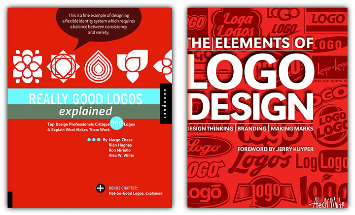
10 Mistakes Designers Make When Creating a Logo (excerpted from page 21 of Really Good Logos Explained: Top Design Professionals Critique 500 Logos & Explain What Makes Them Work)
- Not pairing abstraction to the scale of the business A local plumbing service needs greater specificity than a regional plumbing supply company, and a national plumbing manufacturer can have still more abstraction.
- Attending only to figure and not to ground Logos are such finite marks that every part must be considered and fully used.
- Designing a logo in a vacuum Collect competitors’ logos and design to exceed that specific universe. Present these logos before showing your studies to your client. This provides context and allows your solution to appear properly superior to those against whom your client will be compared.
- Neglecting to blend at least two distinctive ideas together for fresh results “Barbecue” plus “Iceland” are far more useful together than alone as descriptors of a restaurant.
- Not matching the logo with the character of the business The more specific the business, the more expressive the mark’s design should be. The more global the business, the more abstract the logo should be.
- Not giving the logo enough distinction from its competitors Neutral is forgettable. Quirky in a way that promotes genuine character is memorable.
- Not investing time to understand the clients’ unique standing in the business community What makes them viable and how can those qualities be expressed symbolically?
- Using the same pieces as everyone else The fonts and treatments on your computer are like frozen food: mix them any way you’d like but there is a definite limit to how distinctive your cooking can be. Instead, craft materials off computer and then import them.
- Neglecting to optimize the mark for color, gray scale, and line art reproduction …or neglecting to provide basic guidelines for the logo’s use.
- Not preparing scalable artwork that would ensure all type and spacing remains consistently the same “Standing artwork” does not require fonts or other components for correct reproduction and Photoshop artwork is not fully scalable.
© Copyright Alex W. White
* Elegance is not the abundance of simplicity. Elegance is the absence of complexity. ** Good is a solution to a real or clearly stated problem. Good lasts for ten years. † Aesthetics = artistry + inventiveness brought to a problem.