The client’s view of the designer’s logo strategy
Note: This is an adaptation of a video tutorial made for MediaBistro.com.
 Identifying marks have been around since about 15,000bc. Personal identifying marks appeared in about 6,000bc, presumably just after the idea of “ours” was replaced by “mine” and “yours.” Merchants’ marks became common about 800 years ago, identifying products with symbols that could be understood by people who coudn’t read. Logos used in the modern sense were developed during the Industrial Revolution in the late 1800s when manufacturing processes changed dramatically, expanding sales of mass-produced goods.
The dictionary says a logo, short for logotype and from the Greek for “word,” is “a symbol or other small design to identify a company’s products. Synonyms include trademark (a legally registered and protected mark), emblem, brand, device, figure, and signature.”

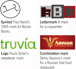
Though “logo” is generally meant and understood to signify any kind of identifying mark, that definition is both too vague and too comprehensive for a logo designer’s needs. A better term is “mark,” which is a visual device showing origin or ownership. It is the parent term for four subgroups:
- Symbol, an icon or a mark without type
- Lettermark, an unreadable monogram
- Logo or logotype, a readable word; a term incorrectly applied to all marks
- Combination mark, a symbol joined with a lettermark or logo
What does a good mark do?
- A good mark identifies ownership of the company, the origin of the product or service, and the manufacturer or provider of services.
- A good mark differentiates one company from its competition and creates an identity – and an experience – that points outward for customers and inward for employees.

- A good mark creates an emotional reaction. In the best circumstances, it ends up being worn and voluntarily adopted for free advertising by those who identify with the brand.
- A good mark is original. Originality can generally be found by solving a very well defined problem. When a visual problem has been fully and completely defined, the solution always presents itself. You just have to notice it when it shows itself. A bad logo lacks its own character and creates a response that “it looks familiar.”
Don’t start a design without an objective
Digital doodles consume time and are ultimately a fruitless process. Pencil and paper first, silicon chip second. Refer often to your well-written job brief to stay on course.

Watch out for using a common, overused idea. Clichés become clichés because they are such good illustrations of an idea. Give an old idea a fresh spin but realize that even your fresh spin has probably already been done. Clients deserve a mark they alone can own.
Elements of surprise in a design are highly effective. “Surprise” is another word for “creative” and creativity is mostly perspiration, not inspiration. Use words to jumpstart visuals. Turn over leaves, try combinations. Don’t settle for okay when great is around the corner.
Recognition without reading

A logo’s shape should be recognizable without having to actually read the mark. Logos with attendant taglines are ordinarily the last part of a message.
A logo doesn’t have to be conspicuous to do its job. Clients sometimes think that making the logo large is a hedge against targets who don’t read the ad or pay attention to any other part of the message. They may be right, but that is not necessarily a measure of success of the tagline or the rest of the message.

All logos are symbolic and abstract to some degree. The more abstract the mark, the more it takes repeated contact to get an audience to recognize and remember it. That demands a client’s investment in time and money. Because it’s very hard to show specifics, conglomerates and global entities benefit from more abstract marks. So do companies whose businesses can’t be easily illustrated. Smaller or local businesses tend to have less abstract, more literal, marks.
Showing your work
- Never show work you don’t like. It’s an unwritten Law of the Universe: the study you like the least will be chosen – and then it’s too late to change. If you don’t love it, the client shouldn’t see it.
- The more studies you present, the more random your process looks to the client. Your thoroughness is perceived as indecision. Show the fewest studies possible: four to seven in Phase One.
- Portray yourself as a problem solver rather than a stylist. James Victore, for one, believes in showing one solution for one problem. That is an extreme that may not work for many designers, but the thinking behind it is admirable.
- Sketch 100, 200, even 500 notions quickly to release mental clichés and explore with a sense of fun and silliness. Think differently and away from your normal work environment. I do some of my best visualizing on the commuter train into New York City and on the subway under Manhattan.
- Catch accidental results before they become embarrassing. Margo Chase reminds us of the too-tight letterspacing between the “L” and “I” in “MEGAFLICKS” and the URLs of such companies as “Who Represents” (whorepresents) and “Experts Exchange” (expertsexchange).
© Copyright Alex W. White
