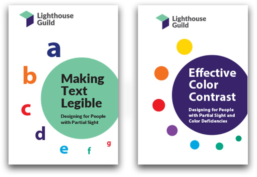
This information is based on a brochure prepared by Lighthouse International, a leading resource on vision impairment and vision rehabilitation. Founded in 1905, they are advocates for people of all ages who are blind or partially sighted. More information can be found at their Web site.
This is a list of ten things to consider when text legibility is essential, as, for example, with sight-impaired readers. However, this list is a applicable to every reader and every text setting. An informed designer must consider each of these text attributes and decide which to honor and which to intentionally bend in service to their message and their design.
- Contrast Highest possible contrast is best: either black on white background or white or light yellow on black background.
- Type color Black on white is best. Colors may be useful for aesthetic reasons, but should be used for headlines and big type.
- Type size Larger is better: 16 to 18 points for text is wonderfully generous.
- Line spacing Increase by 25% to 30% of type’s size being used.
- Typeface family Avoid decorative, complicated, or cursive fonts. Choose standard weight serif and sans serif faces with easily recognizable characters.
- Typeface style A roman typeface using upper and lowercase letters is more legible than italics, obliques, or condensed types. All caps settings are very difficult to read because word shapes are consistently brick like.
- Letterspacing Slightly more open than normal letterspacing is preferred because it allows each letter shape to be more easily discerned.
- Margins Wide binding margins allow the text-covered part of the page to lay flat. Flatness matters when using a video magnifier or magnifying glass.
- Paper finish Glossy paper makes reading much more difficult because it has reflective, shiny hot spots.
- Distinctiveness Similar-looking documents can be easily mistaken for each other, particularly, for example, in booklet series. Use distinctive cover colors, sizes, and formats.
